Analyzing Histograms and Creating Classes
In the Histogram Analysis dialog you can plot and analyze the distribution of scalar data contained in a multi-ROI,
Click the Histogram tool on the Data Properties and Settings panel or click the Histogram Analysis button on the Analyze and Classify Measurements module to open the Histogram Analysis dialog, as shown in the following screen captures.
Histogram Analysis dialog

The Histogram Analysis dialog includes a Statistics tab, on which you can compute basic statistics, such as the minimum, maximum, mean, and median values within the selected data (see Computing Basic Statistics), as well as a Classification tab, on which you can create classes by selecting instances in the data that match some criteria (see Creating Classes). Instances can be added to classes on 1D histograms with the Range Selector tool and by painting on 2D histograms.
The following options are available for analyzing histograms of the scalar values contained in a multi-ROI, mesh, graph, or vector field.
| Description | |
|---|---|
| Tools panel | The tools at the top of the dialog let you to pan, zoom, and reset the histogram, as well as save the figure and export the plotted values in the comma-separated values (*.csv extension) file format (see Histogram Tools). |
| Histogram |
Displays an approximate representation of the distribution of the selected scalar value(s), in which the range of values are divided into 'bins' on a 1D or 2D histogram. In other words, it provides a visual interpretation of numerical data by showing the number of data points that fall within a specified range of values.
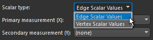
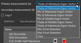
You can select the scalar slot(s) from which values will be extracted and plotted in the Primary measurement (X) and Secondary measurement (Y) drop-down menus as follows: Primary measurement (X)… The selected measurement will be plotted on a 1D histogram. Secondary measurement (Y)… The selected measurements will be plotted on a 2D histogram using Cartesian or polar coordinates. 2D histograms are useful when you need to analyze the relationship between 2 numerical variables that have a large number of values. Note For meshes, you may also need to selected a scalar type — Face Scalar Values or Vertex Scalar Values — in the Scalar type drop-down menu. For graphs, you will need to select a scalar type — Edge Scalar Values or Vertex Scalar Values — in the Scalar Type drop-down menu, as shown below.
If you selected Cartesian for the 2D histogram, then Cartesian coordinates will be used to display the selected measurements in which the X-axis represents the values of the primary measurement and the Y-axis the values of the secondary measurement. If you selected Polar for the 2D histogram, then the histogram will be drawn in the polar coordinate system — a two-dimensional coordinate system where each point is determined by a distance from a fixed point and an angle from a fixed direction. Rather than using the standard X and Y coordinates, each point on a polar plane is expressed using these two values:
The plane itself is made up of concentric circles expanding outward from the origin, or the pole. Polar plots are often used when the analyzing data that has a cyclical nature, as shown in the example below.
Note Secondary measurements for polar plots are automatically divided into 8 bins with ranges of 0-45, 45-90, 90-135, 135-180, 180-225, 225-270, and 270-360. In this case, values of 90 degrees will be binned in the range 90-135. |
| Y log | If selected, the Y-axis will be plotted in log scale on 1D histograms or the intensity of squares or sectors will be increased on 2D histograms. |
| Bin count |
Determines the interval in which values will be binned.
Whenever a histogram is constructed, the first step is to 'bin' the range of values — that is, divide the entire range of values into a series of intervals — and then count how many values fall into each interval. The height of each bin shows how many values from that data fall into that range. The bins are consecutive, non-overlapping intervals of a variable. Note To get meaningful results, selecting an appropriate bin count is crucial. Bins that are too wide can hide important details about distribution while bins that are too narrow can cause spikes just by coincidence. |
| Statistics tab | Lets you select the statistic(s) that will be computed and shown on the histogram and in the Statistics box (see Computing Basic Statistics). |
| Classification tab |
Includes options for creating and editing classes (see Creating Classes). |

The tools at the top of the Histogram dialog let you to pan, zoom, and reset the histogram, as well as save the figure and export data.
| Item | Icon | Description |
|---|---|---|
| Pan |
|
Pans or zooms the figure as described below.
Pan… Click with the left mouse button and then drag to pan the figure. Zoom on the Y axis… Click with the right mouse button and then drag up and down to Zoom in and Zoom out on the Y axis. Zoom on the X axis… Click with the right mouse button and then drag left and right to Zoom in and Zoom out on the X axis. |
| Zoom |
|
Zooms to a drawn rectangle, which can be defined by dragging your cursor over the area that you want to zoom. |
| Reset |
|
Resets the original view of the figure. |
| Save |
|
Saves the figure as a bitmap image, vector graphic, or in the PDF file format. The figure can also be saved as raw data or PGF code.
Standard image files (*.jpeg, *.jpg, *.png, *.tif, *.tiff extensions)… Saves the histogram or profile as a bitmap image in the screen resolution. Postscript files (*.eps, *.ps extensions)… Saves the histogram or profile as an encapsulated postscript or postscript file. These types of files have a selectable resolution and provide high-quality graphics for publications. PGF code for LaTeX (.pgf extension)… Saves the histogram or profile in the Portable Graphics file format. The standard LaTeX picture environment can be used as a front end for PGF merely by using the Raw RGBA bitmap (*.raw, *.rgba extensions)… Saves the histogram or profile as a raw bitmap image file, in which the file contains only a list of pixel colors and nothing else. Scalable vector graphics (*.svg, *.svgz extensions)… Saves the histogram or profile in an XML-based vector image format. The SVG specification is an open standard developed by the World Wide Web Consortium (W3C). SVG images and their behaviors are defined in XML text files. Portable document format (*.pdf extension)… Saves the histogram or profile in the Adobe PDF file format. |
| Settings |
|
Opens the Figure options dialog, shown below, in which you can select the plotted ranges, scaling, and labels for the axes.
|
| Export to CSV |
|
Exports the plotted values in the comma-separated values (*.csv extension) file format. |

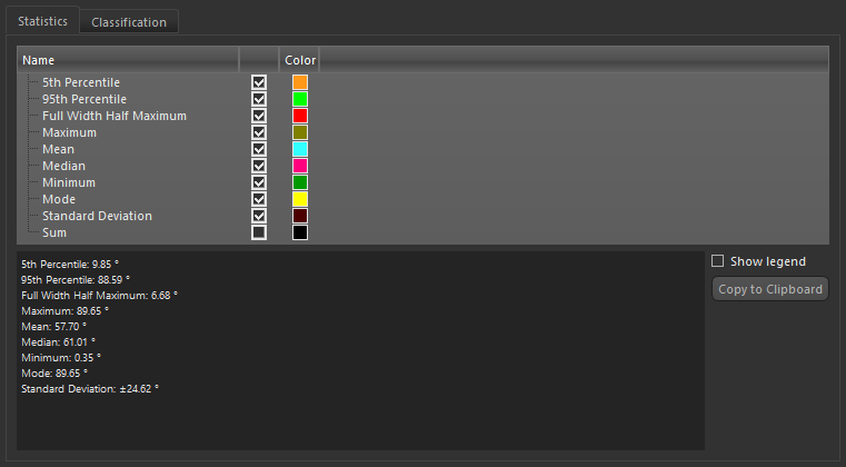
You can compute basic statistics, such as the minimum, maximum, mean, and median values within a selected scalar data, on the Statistics tab.
Computed statistics in the Histogram Analysis dialog

You should note that statistics are calculated from the histogram and not directly from the data. Selecting the correct bin count is critical for achieving meaningful results and experimentation might be needed to determine an appropriate width.
However, there are various useful guidelines and methods to compute bin counts. These include the 'square-root choice', which takes the square root of the number of data points in the sample and rounds to the next integer, Sturges' formula, Freedman–Diaconis' choice, and others. The Wikipedia page on histograms (https://en.wikipedia.org/wiki/Histogram) lists eight such methods.
The following statistics and other options are available on the Statistic tab in the Histogram Analysis dialog.
| Item | Description |
|---|---|
| 5th Percentile | Is the value below which 5% of the values within the distribution may be found. |
| 95th Percentile | Is the value below which 95% of the values within the distribution may be found. |
| Full Width Half Maximum |
Is the width of the curve as measured between points on the Y-axis which are at the peak half maximum value.
Note FWHM can be more sensitive to bin count than other statistics. It might not be possible to compute FWHM when the bin count becomes too high and there are not enough bins with values greater than 'Maximum/2'. |
| Maximum | Is the maximum value within the distribution. |
| Mean | Is the mean value within the distribution. |
| Median | Is the median value within the distribution. |
| Minimum | Is the minimum value within the distribution. |
| Mode | Is the most commonly occurring value within the distribution. |
| Standard Deviation |
Is the population standard deviation, which is a measure of the amount of variation or dispersion within a set of values. Shown as the range from the mean value on the histogram.
Note Although both population and sample standard deviations measure variability, there are differences between these two computations. If you are calculating the population standard deviation, then you divide by 'n', which is the number of data values. If you are calculating the sample standard deviation, then you divide by 'n -1', which is one less than the number of data values. This means that the sample standard deviation will have greater variability than that of the population. |
| Sum | Is the integral of all values within the distribution. |
| Show legend | If selected, a legend with the selected statistics will be superimposed on the histogram. |
| Copy to Clipboard | Copies the selected statistics to the clipboard, which can be pasted into any word processing or spreadsheet application. |
-
Do one of the following:
- Select the required multi-ROI, mesh, graph or vector field in the Data Properties and Settings panel and then click the Histogram
 button in the Tools box in the Scalar information box.
 - Click the Histogram Analysis button in the Feature Analysis dialog.
The Histogram Analysis dialog appears.
- Select the required multi-ROI, mesh, graph or vector field in the Data Properties and Settings panel and then click the Histogram
-
If you are computing statistics for a graph, select a scalar type — Edge Scalar Values or Vertex Scalar Values — in the Scalar Type drop-down menu, as shown below.
- Select the scalar slot from which values will be extracted in the Primary measurement (X) drop-down menu.
Note Statistics will not be available if you select a secondary measurement to plot a 2D histogram.
The histogram of the selected measurement appears in the Histogram Analysis dialog.
- Do the following, as required.
- Plot the Y-axis of the histogram in log scale.
- Set the optimal bin count for your data. You should note that statistics are calculated from the histogram and not directly from the data.
- Select the required statistics on the Statistics tab, as shown below.
Note You can add a legend to the histogram by checking the Show legend option, as well as copy the computed statistics to the clipboard.
You can create classes to group objects that share specific characteristics — either by selecting ranges on a 1D histogram (see Creating Classes on 1D Histograms) or by painting on 2D histograms on which multiple properties are plotted (see Creating Classes on 2D Histograms).
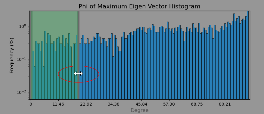
Classes created on a 1D histogram

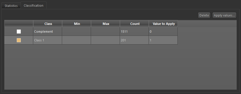
The following parameters and options are available on the Classification tab in the Histogram Analysis dialog.
| Description | |
|---|---|
| Color | Displays the color associated with each class. |
| Class | Displays the class names — Complement, Class 1, Class 2, Class 3, and so on. Note that 'Complement' includes all values not assigned to a class. |
| Min | Indicates the minimum value within each class. |
| Max | Indicates the maximum value within each class. |
| Count | Indicates the number of instances within each class. |
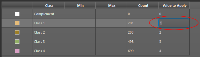
| Value to apply | Lets you choose the value that will be applied to each class. Default settings are '0' for Complement, '1' for Class 1, '2' for Class 2, '3' for Class 3, and so on. |
| Delete | Deletes the selected class row(s). |
| Apply values | Adds a new 'class' measurement or overwrites an existing measurement. |
You can create classes to group objects that share specific characteristics by selecting ranges on a 1D histogram.
-
Do one of the following:
- Select the required multi-ROI, mesh, graph or vector field in the Data Properties and Settings panel and then click the Histogram button in the Tools box in the Scalar information box.
- Click the Histogram Analysis button in the Feature Analysis dialog.
The Histogram Analysis dialog appears.
- Select the required multi-ROI, mesh, graph or vector field in the Data Properties and Settings panel and then click the Histogram
-
If you are computing statistics for a graph, select a scalar type — Edge Scalar Values or Vertex Scalar Values — in the Scalar Type drop-down menu, as shown below.
- Select the scalar slot from which values will be extracted in the Primary measurement (X) drop-down menu.
The histogram of the selected measurement appears in the Histogram Analysis dialog.
- Do the following, as required.
- Plot the Y-axis of the histogram in log scale.
- Set the optimal bin size for your data.
- Click the Classification tab.
- Drag your cursor over the histogram to add a selection to a new class, as shown below.
The new class and its complement appear in the Classes box.
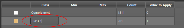
Note You can double-click the name of a class and then enter a new name. You can also delete a class, in which case all objects in the class will moved to 'Complement'.
- Add additional classes, as required.
Each time that you make a new selection on the histogram, a new class will be created automatically.
- Edit the default value assigned to each class, if required.
- Click the Apply values button and then do one of the following:
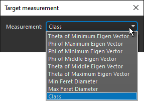
- Create a new measurement in the Target Measurement dialog, as shown below.
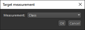
Note You edit the name of the new measurement, if required.
- Overwrite an existing measurement. You can choose the measurement to overwrite in the Target Measurement dialog, as shown below.
- Create a new measurement in the Target Measurement dialog, as shown below.
You can create classes to group objects that share specific characteristics by painting on 2D histograms on which multiple properties are plotted.
2D histogram

-
Do one of the following:
- Select the required multi-ROI, mesh, graph or vector field in the Data Properties and Settings panel and then click the Histogram button in the Tools box in the Scalar information box.
- Click the Histogram Analysis button in the Feature Analysis dialog.
The Histogram Analysis dialog appears.
- Select the required multi-ROI, mesh, graph or vector field in the Data Properties and Settings panel and then click the Histogram
- Do the following:
- Select the scalar slot from which values will be extracted in the Primary measurement (X) drop-down menu.
- Select the scalar slot from which values will be extracted in the Secondary measurement (Y) drop-down menu.
The default 2D histogram of the selected measurements appears in the Histogram Analysis dialog.
- Choose the coordinate system for plotting the values — Cartesian or Polar.
Note In the case of polar plots, painting is done on annular sectors.
- Do the following, as required.
- Plot the Y-axis of the histogram in log scale.
- Set the optimal bin size for your data.
- Click the Classification tab.
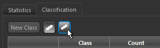
- Click the Square or Round Brush tool.
Note An initial class is created automatically by clicking on the histogram.
- Do the following to add or remove selections from the initial class:
- Hold down Left Ctrl (or your configured Add with key) and then drag in the histogram to add selections to the initial class.
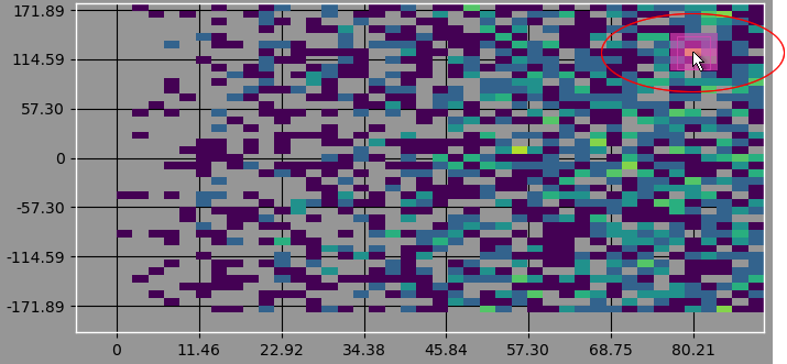
- Hold down Left Shift (or your configured Remove with key) and then drag in the histogram to remove selections from the initial class.
Note You can change the diameter of the brush with the mouse scroll wheel.
- Hold down Left Ctrl (or your configured Add with key) and then drag in the histogram to add selections to the initial class.
- If required, you can create additional classes as follows:
- Click the Add Class button below the histogram.
- Use the Square or Round Brush tool to add selections to the new class, as described previously.
Note If you draw over an existing class in 'Add' mode, the intersecting selection will be moved to the new class.
- Use the Square or Round Brush tool to remove selections from the new class, as described previously.
Note In 'Remove' mode, only selections belonging to the selected class will be removed. Selections belonging to all other classes will remain as is.
- Continue to add classes until your classification is complete.
- Click the Apply values button and then do one of the following:
- Create a new measurement in the Target Measurement dialog, as shown below.
Note You edit the name of the new measurement, if required.
- Overwrite an existing measurement. You can choose the measurement to overwrite in the Target Measurement dialog, as shown below.
- Create a new measurement in the Target Measurement dialog, as shown below.